Alot of the London olympics designs have been a massive disappointment so far, starting with the logo unvailed by Wolff Olins a few years back...
Then there was the rather unsightly Anish Kapoor sculpture for the olympic park that looked more like a rollercoaster than a new landmark to represent London...
And again, then there was the mascots 'Manlock and Mandiville' which looked like creates from the film Monsters Inc...
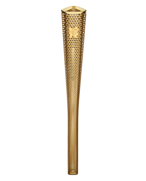
But finally, a designers BarberOsgerby might have a winner. The design for the London 2012 torch is simple, sleek and understated. The only bad point is that awful logo is still on it!


No comments:
Post a Comment